
Impact of CTA on Websites
A website can have beautiful design, strong branding, and helpful content—yet still fail to generate leads or sales. The usual reason is simple: visitors don’t know what to do next.
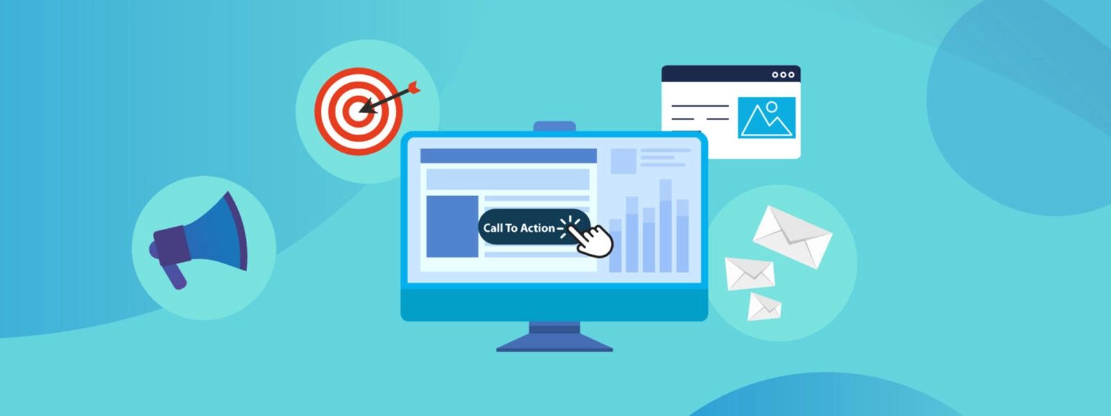
That’s where a Call to Action (CTA) becomes one of the most valuable elements on any website.
A CTA is a prompt—often a button, link, banner, form, or short line of text—that encourages a visitor to take a specific action, such as:
- Request a quote
- Book a consultation
- Subscribe to a newsletter
- Download a guide
- Start a free trial
- Add an item to cart
- Contact sales
- Read the next article
CTAs may look small, but they’re the bridge between interest and outcome. When implemented strategically, CTAs guide users through your website, reduce confusion, increase engagement, and improve the signals that search engines use to evaluate your site’s usefulness.
This article explains how CTAs impact your website’s performance, how they connect with SEO and user experience, and how to create CTAs that are clear, persuasive, accessible, and mobile-first—so you can turn visitors into customers.
Why CTAs Matter More Than Ever
Modern websites compete for attention in a world of short sessions, mobile browsing, and unlimited choice. People scan more than they read. They click when they feel confident—and they leave when they don’t.
A well-designed CTA helps your website do three things:
1. Give visitors direction
Visitors arrive with questions, goals, and varying levels of intent. CTAs help them find the next step that matches their intent.
2. Reduce friction
When users can take action easily (and safely), conversion rates rise. When action feels unclear, risky, or hard, they bounce.
3. Turn traffic into outcomes
SEO can drive visitors to a page, but CTAs convert that attention into leads, sales, and enquiries—the metrics that truly move the business.
CTA and SEO: What’s the Connection?
1) Better engagement metrics
Strong CTAs can increase:
- Time on site (users navigate deeper)
- Pages per session (clear pathways)
- Return visits (subscriptions and retention CTAs)
- Lower bounce rates (better next-step clarity)
While search engines don’t use all engagement metrics as direct ranking factors in a simple way, engagement patterns often correlate with content quality and user satisfaction—two things Google consistently values.
2) Improved internal linking and crawlability
CTAs often link to important pages like:
- Service pages
- Product categories
- Contact pages
- Case studies
- Pricing pages
When those links are placed strategically, you strengthen:
- Internal link structure
- Topical relevance
- Crawl paths to your money pages
3) Higher conversion value per visit
Even if rankings stay the same, improved CTAs increase the ROI of your SEO traffic, which allows you to reinvest more in content, technical SEO, and link-building.
4) Supports E-E-A-T signals through clarity and trust
Google’s quality guidance emphasizes content that is helpful, trustworthy, and clearly aligned to user needs. CTAs can reinforce credibility by offering:
- Evidence (case studies, testimonials)
- Next-step resources (guides, checklists)
- Low-friction contact options (chat, callback, booking)
What Is the Real Impact of CTAs on Websites?
1) CTAs Avoid Confusion (and Stop Visitors From Stalling)
The most common website problem isn’t lack of content. It’s lack of direction.
Visitors often ask:
- “Is this right for me?”
- “Is this right for me?”
- “How do I buy/book/contact?”
- “Where’s the proof this works?”
A good CTA answers those questions by creating a clear pathway.
Example (Service business):
- Instead of: “Learn More”
- Use: “See Our Services” or “Get a Free 15-Minute Consultation”
- Instead of: “Submit”
- Use: “Add to Cart” or “Checkout Securely”
2) CTAs Create an Organised, Easy-to-Navigate Website
CTAs work like signposts. When they’re placed thoughtfully across pages, they create a predictable journey:
- Homepage → service category
- Service page → quote request
- Blog post → related guide or service page
- Case study → booking CTA
- Pricing page → purchase CTA
This makes your site feel more “designed” and less like a collection of disconnected pages.
Impact: Improved user flow, stronger site architecture, and higher conversions.
3) CTAs Guide Visitors Based on Intent (Not Every Visitor Is Ready to Buy)
- “Read the Beginner’s Guide”
- “Watch a 2-Minute Overview”
- “Compare Your Options”
- “View Case Studies”
- “See Pricing”
- “Download the Checklist”
- “Book a Call”
- “Get a Quote”
- “Start Free Trial”
- “Buy Now”
A single page can support multiple intents using primary and secondary CTAs (more on this below).
Impact: You capture more leads across the entire funnel, not just the “ready-to-buy” audience.
4) CTAs Increase Conversions (The Most Measurable Benefit)
Conversion improvements come from two places:
- Better clarity: users understand the next step
- Better persuasion: users feel motivated and safe taking the step
- Avoid loading marketing tags before consent where legally required.
When your CTA aligns with the page’s purpose and the visitor’s intent, conversion rates can increase dramatically—especially on high-traffic pages like:
- Homepages
- Service pages
- Top blog posts
- Pricing pages
- Landing pages (paid campaigns)
Why CTAs Work: The Psychology Behind Action
CTAs are effective because they match how humans make decisions online.
People prefer guidance
Most visitors are not deeply analysing your site. They’re scanning, comparing, and looking for the “obvious next step.” CTAs reduce cognitive load by making choices clear.
People respond to clarity and specificity
“Click here” is vague. “Get a Free Quote” is specific. Specific CTAs increase confidence because users know what happens next.
People are motivated by benefit (not features)
A CTA that focuses on value performs better than one that focuses on mechanics.
- Weak: “Submit”
- Strong: “Get My Free Report”
- Weak: “Contact”
- Strong: “Talk to an Expert Today”
People avoid risk
CTAs perform better when paired with reassurance:
- “No spam”
- “Cancel anytime”
- “Secure checkout”
- “Response within 1 business day”
Types of CTAs You Should Use on a Modern Website
1) Primary CTA (the main action)
This is the “best next step” for most visitors on a page.
- “Book a Call”
- “Get a Quote”
- “Start Free Trial”
- “Shop Now”
2) Secondary CTA (a lower-commitment alternative)
This captures visitors who aren’t ready to convert yet.
- “View Case Studies”
- “Download the Guide”
- “See Pricing”
- “Read Reviews”
3) Micro-CTAs (small actions that build momentum)
Micro-CTAs reduce friction and keep users moving.
- “Scroll to pricing”
- “See features”
- “Watch demo”
- “Check availability”
4) Content upgrade CTAs (lead magnets)
These work especially well on blog posts:
- “Download the checklist”
- “Get the template”
- “Email me the guide”
5) Sticky and persistent CTAs (mobile-first)
On mobile, attention is limited. Sticky CTAs can help (used carefully):
- Sticky “Call now”
- Sticky “Book” button
- Floating chat widget
CTA Best Practices: How to Use CTAs Effectively
1) Give visitors a reason (benefit-first messaging)
A CTA should answer: “What’s in it for me?”
Try benefit-driven copy:
- “Get a Faster Quote”
- “Reduce Your IT Costs”
- “Improve Your Website Speed”
- “Increase Leads With a Free Audit”
Pair it with short supporting text when needed:
- “Get a free SEO audit in 48 hours.”
- “No obligation. We’ll send recommendations you can implement.”
2) Make CTA copy clear, short, and action-oriented
Strong CTA verbs include:
- Get, Start, Book, Download, Compare, Explore, See, Request, Join
- Better: “Request a Proposal”
- Better: “Book a Demo”
- Better: “Get My Free Quote”
- Avoid: “Click Here”
- Avoid: “Submit”
- Avoid: “Learn More” (unless it’s the right intent)
3) Place CTAs where users naturally decide
CTA placement should match scanning behaviour.
Common high-performing placements:
- Above the fold (especially on landing pages)
- After explaining benefits
- After testimonials or proof
- End of blog posts (contextual CTA)
- Mid-article (for long-form content)
- In navigation (e.g., “Book a Call” button)
- On mobile as a simplified, persistent option
Rule of thumb: Don’t force a CTA too early. Earn the click with context first.
4) Use design to make CTAs easy to notice (without being spammy)
A CTA should stand out, but still feel consistent with your brand.
Practical design tips:
- Use high-contrast buttons (contrast matters more than colour choice)
- Ensure enough whitespace around CTAs
- Keep button sizes large enough for touch (mobile-friendly)
- Use consistent styling for primary vs secondary CTAs
- Avoid clutter: too many competing buttons reduce clicks
5) Optimise CTAs for mobile-first users
Mobile users have different needs:
- Less patience for long forms
- Smaller screens and thumb navigation
- More likely to prefer click-to-call or quick booking
Mobile CTA improvements:
- Shorter forms (name + email can outperform long forms)
- Click-to-call and “Request callback”
- Sticky CTA for service pages (careful not to block content)
- Clear tap targets and spacing
- Fast-loading pages (CTAs don’t matter if the page is slow)
6) Make CTAs accessible and inclusive
Accessibility isn’t optional—it affects usability, conversion rate, and compliance.
Checklist:
- Buttons must be keyboard accessible
- Provide clear focus states
- Ensure sufficient text contrast
- Use descriptive labels (avoid “Read more” without context)
- Don’t rely on colour alone to communicate meaning
- Add ARIA labels when needed (especially icons)
7) Build trust around the CTA (reduce risk)
If a visitor hesitates, it’s often because they fear:
- being spammed
- wasting time
- hidden costs
- unclear outcomes
Add reassurance near CTAs:
- “No spam. Unsubscribe anytime.”
- “We respond within 1 business day.”
- “Fixed pricing available.”
- “Secure payment.”
Trust elements that improve CTA performance:
- Testimonials and reviews
- Client logos
- Case studies
- Guarantees (if legitimate and supportable)
- Clear privacy messaging
CTA Examples You Can Use (By Website Type)
Service businesses (SEO, IT, consulting, trades)
- “Book a Free Consultation”
- “Request a Quote”
- “Get a Website Audit”
- “Schedule a Call”
- “Talk to a Specialist”
Secondary CTAs:
- “View Case Studies”
- “See Our Process”
- “Explore Pricing”
- “Read Customer Reviews”
Ecommerce
- “Add to Cart”
- “Buy Now”
- “Checkout Securely”
- “Get Free Shipping”
- “Find My Size”
Secondary CTAs:
- “Save to Wishlist”
- “Compare Options”
- “Read Reviews”
- “See Returns Policy”
SaaS and tech products
- “Start Free Trial”
- “Book a Demo”
- “See It in Action”
- “Compare Plans”
- “View Integrations”
Secondary CTAs:
- “Watch Demo Video”
- “Read Documentation”
- “See Customer Stories”
Blogs and content sites
- “Download the Checklist”
- “Get the Template”
- “Subscribe for Updates”
- “Read Next Article”
- “Explore Related Topics”
Common CTA Mistakes (and How to Fix Them)
Mistake 1: Too many CTAs competing on one screen
Fix: Choose one primary CTA per section. Use secondary CTAs sparingly.
Mistake 2: Vague copy (“Learn More” everywhere)
Mistake 3: Asking for too much too soon
Mistake 4: CTAs that don’t match the page content
Mistake 5: No measurement or testing
Fix: Track clicks, conversions, scroll depth, and test variations.
Measuring CTA Performance (So You Know What’s Working)
You can’t improve what you don’t measure. Track CTAs like any other business asset.
Key metrics:
- CTA click-through rate (CTR)
- Conversion rate (form submissions, purchases, bookings)
- Scroll depth (are people even reaching the CTA?)
- Mobile vs desktop performance
Practical measurement ideas:
- Set up conversion events (form submit, call clicks, booking completed)
- Track CTA button clicks as events
- Use heatmaps/session recordings (for UX insights)
- Run A/B tests on copy, placement, and layout
CTA Opportunities You Should Add Across Your Website
If you want fast wins, start here:
Homepage
- Primary CTA in hero section (“Get a Quote” / “Book a Call”)
- Proof section → CTA (“See Results” / “View Case Studies”)
- Footer CTA (“Talk to our team”)
Service pages
- CTA after benefits + after proof
- “Request a quote” + “See pricing” (if available)
- Click-to-call on mobile
Blog posts
- Contextual CTA mid-post
- End-of-post CTA (content upgrade or relevant service)
- Related articles CTA block
About page (often high-traffic)
- “Meet the Team” + “Book a Call”
- “See how we work” CTA
- Trust CTA (“Read reviews”)
Contact page
- Multiple contact options (form + phone + email + booking)
- Clear response timeframe
- Privacy reassurance
Since most users and therefore Google prefer mobile-first websites, it’s essential to create CTAs optimised for small screens. Read our blog on tips for effective CTAs to create excellent CTAs.
Have queries on CTA or SEO? Our SEO experts can assist you with it. Contact us or email at sales@computingaustralia.group.
Jargon Buster

Peter Machalski
FAQ
What is a CTA on a website?
A CTA (Call to Action) is a prompt that encourages visitors to take a specific step—such as book a call, request a quote, subscribe, download a guide, or buy a product. CTAs usually appear as buttons, links, banners, or form prompts.
How do CTAs improve website conversions?
CTAs improve conversions by removing uncertainty and telling users exactly what to do next. When CTAs are clear, benefit-driven, and placed at the right moment, they reduce hesitation and increase actions like enquiries, signups, and purchases.
Do CTAs help SEO?
CTAs don’t directly increase rankings on their own, but they can support SEO indirectly by improving user engagement (more time on site, more pages visited), strengthening internal linking, and helping visitors find relevant pages—signals that often align with better overall site quality.
Should CTAs be different on mobile?
Often, yes. Mobile CTAs should be easier and faster (click-to-call, short forms, simple booking). Also ensure buttons are thumb-friendly and don’t block content.
What makes a CTA effective?
An effective CTA is:
Specific (e.g., “Get a Free Quote”)
Benefit-focused (what the user gains)
Easy to notice (strong contrast/spacing)
Low friction (short forms, clear next step)
Mobile-friendly (tap-friendly buttons, simple layout)


